My past few Flash Thoughts have felt more like just Regular Thoughts. The original plan was to have these be bite-sized, so let's get back on track with that.
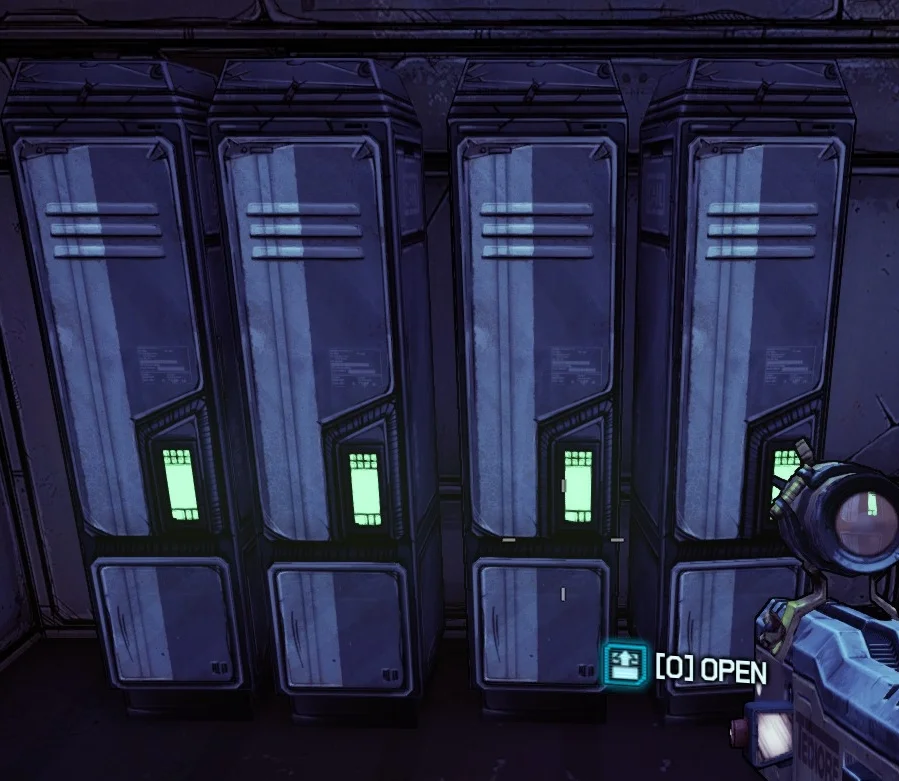
I noticed something neat today with the loot in Borderlands: they all have a bright green label when unopened, and then turn grey and dark after being opened.
You'll notice that, in fact, every lootable thing has the same shade of green in a vaguely square/rectangular shape. Interactible things as a whole are also green, but can also be button-shaped for things like. buttons.
This is cute UX design. Signifier consistency (green rectangles) across different box shapes enforce the signified of "loot". Players will automatically get a baby hit of dopamine when they see the green, and also of course by turning that green to grey through looting.
Additionally, it helps players know at a glance how to differentiate between lootable stuff and generic objects, since the devs were careful to avoid putting tiny green rectangles on nonlootables.


